Assa Abloy
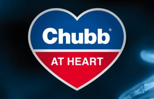
Chubb at Heart
ASSA ABLOY are the global leader in door opening solutions and home to some of the world’s most recognised security brands including Yale, Chubb and UNION. When Chubb was no longer going to be available, we were asked to help with some Brand repositioning.
The Brief
The Chubb brand has been synonymous with locks for over 200 years. It is a key part of ASSA ABLOY’s product range. The brand itself is owned by an American company who are more focused on their Fire and Security business. When they announced that the license to use the Chubb brand for locks would not be renewed, ASSA ABLOY faced a major dilemma.
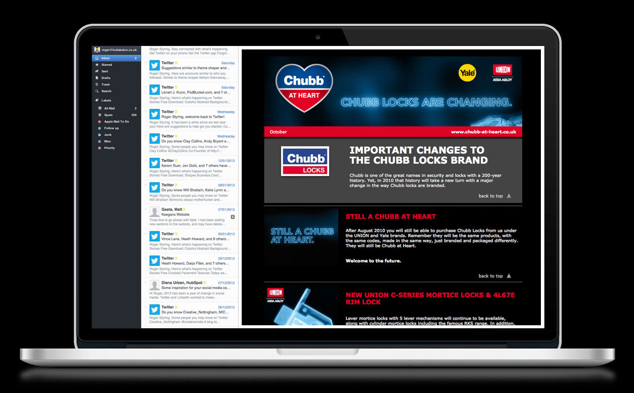
The product range would actually continue almost unchanged under the Yale and UNION brands. Our brief was to communicate this brand repositioning to the locksmiths, tradesmen, consumers and insurance and security companies. These customers have known and trusted the Chubb brand for many years – so no pressure there then!
Our Solution
Initially the brief seemed like something of a poison chalice. We were painfully aware that Chubb has a long and rich heritage for staff, locksmiths and consumers alike. It is one of the world’s more recognised brands. How could we turn the loss of such a valuable asset into a positive brand repositioning?
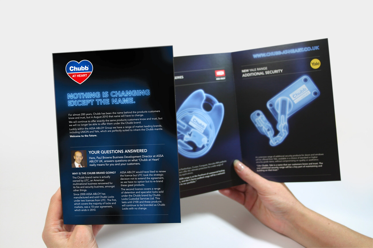
The turning point in our thinking came when we decided to embrace the sense of loss everyone felt for the brand, and stop trying to pretend it was a positive. Instead, we devised a campaign that made it plain ASSA ABLOY shared everyone’s regret at the loss of the brand. We made it clear they had great pride in the brand’s achievements, but also emphasised the fact that aside from the name, nothing was changing. The offering was still ‘Chubb at Heart’.
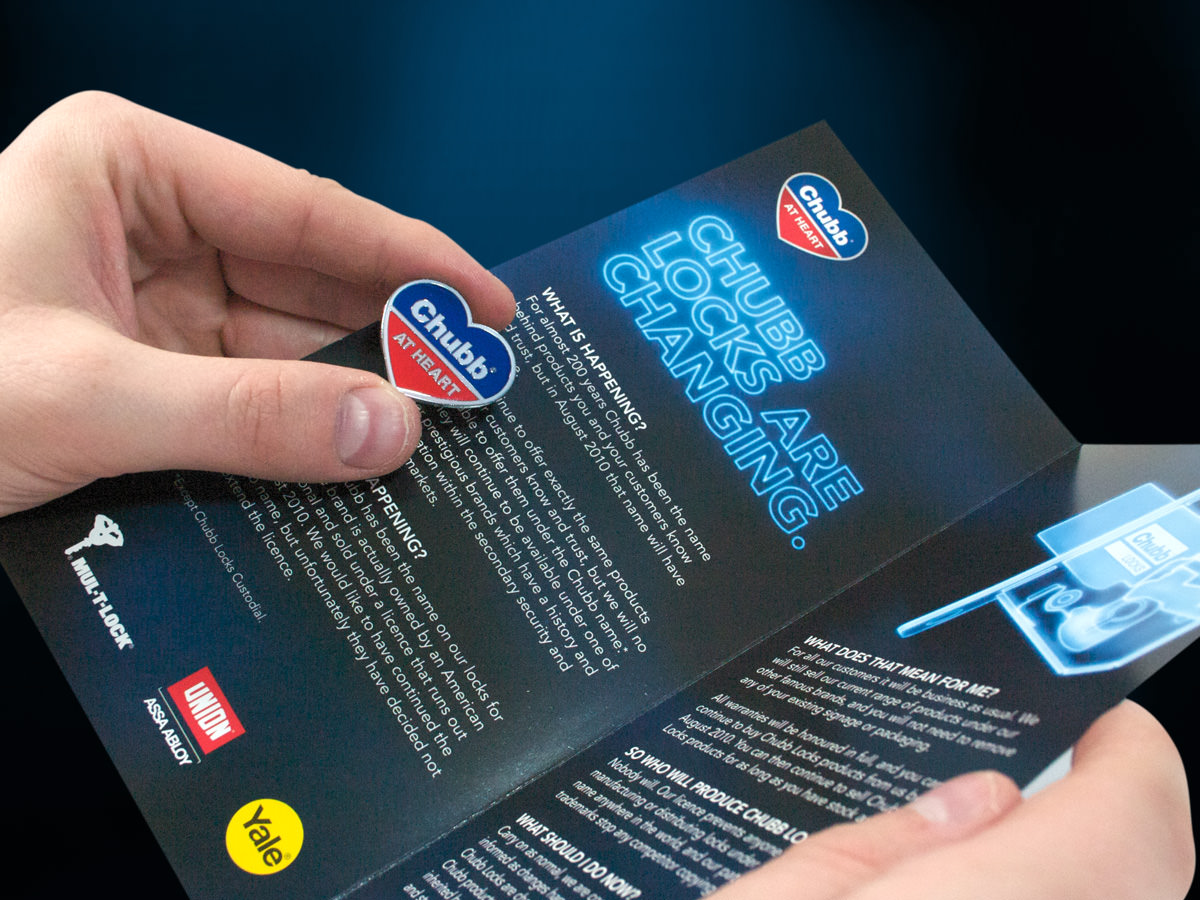
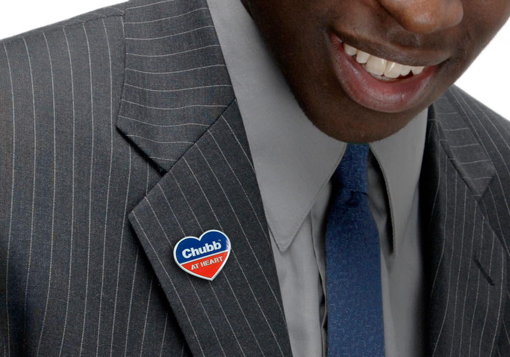
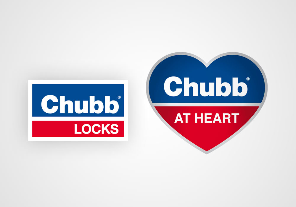
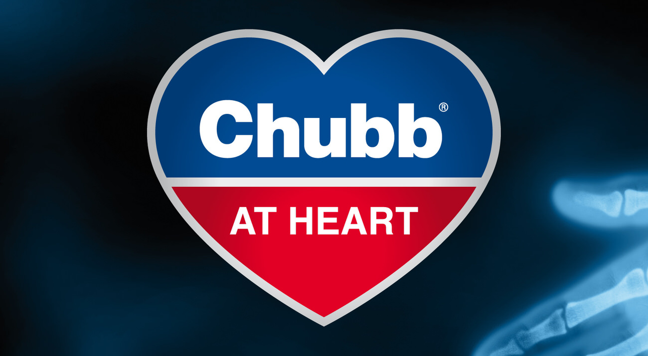
The Chubb at Heart logo was formed from the component parts of the original Chubb Locks brand. this made it instantly recognisable. The heart was used to symbolise the emotive attachment that people had to this great brand.
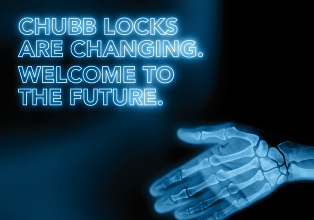
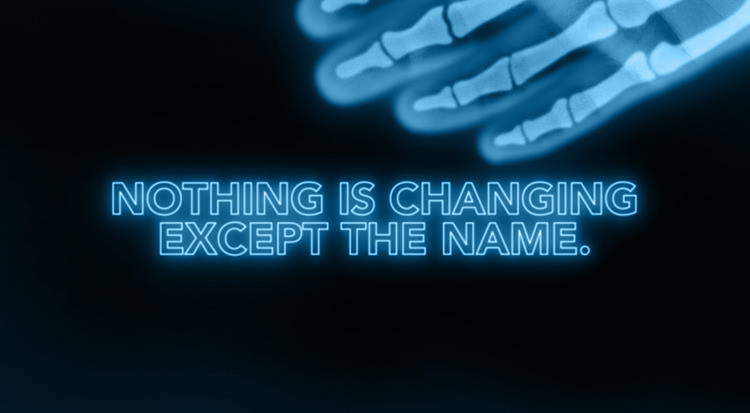
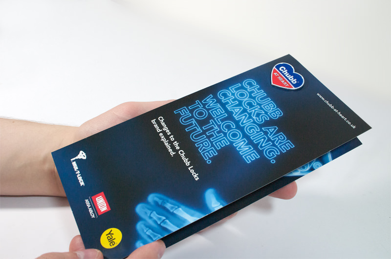
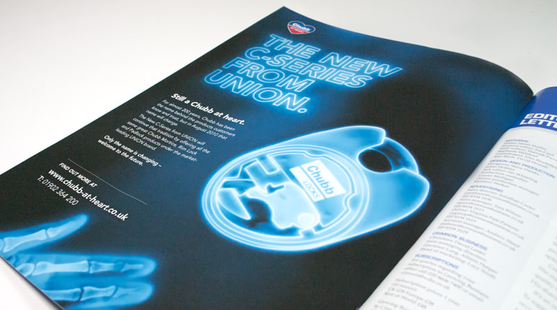
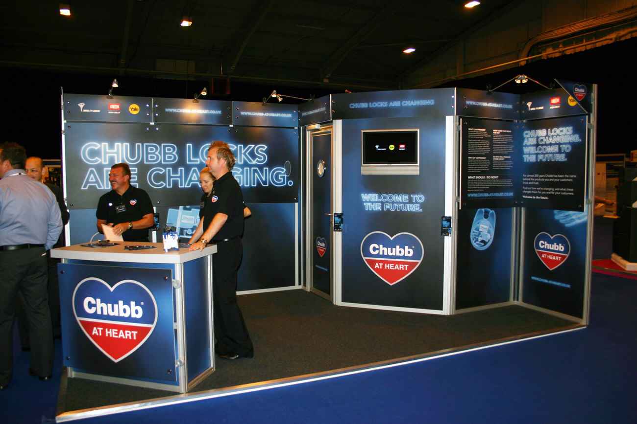
The branding served as a great figurehead and rallying cry for the campaign. We also then created a visual style with loads of impact, that would reinforce our core message. We devised a style based on X-ray imagery – showing the Chubb products with the Chubb branding still displayed under the skin. This showed that even with the new branding, the products were literally ‘Chubb at Heart’.
The headlines used throughout the campaign reinforced this. Driving home the messages that ‘nothing was changing except the name’ and ‘welcome to the future’. Both of these further highlighted the positive message of the campaign.
