Whatever happened to...
Whatever happened to Letraset?
Posted by Colin Higton
Letraset (for those of you who don’t know) was the brand name for the original dry-transfer lettering product that revolutionised graphic design in the 1960s.
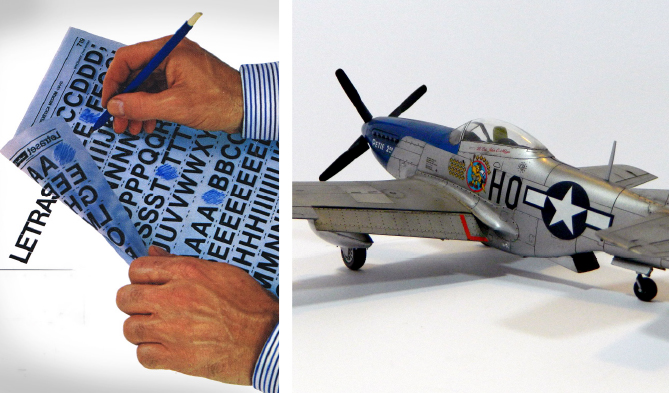
In my spare time I build scale model aircraft (Airfix, Revell, Academy etc.) and if you have ever done that you will know that you apply the markings using water-slide decals. Applying Letraset was a lot like using those – but without the water.
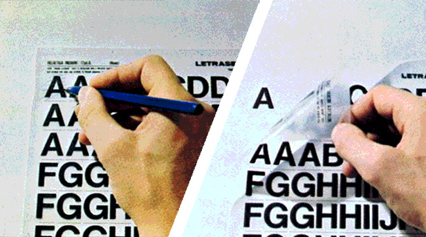
It basically consisted of an alphabet of letters screen printed onto the reverse of a sheet of translucent (usually blue/grey) film and then coated with an adhesive. This meant that you could lay the film onto a sheet of paper and by carefully rubbing on the front of the sheet (with a blunt pencil or ballpoint pen) ‘transfer’ the letter to the sheet of paper – like a sticker, but only as thick as the ink it was printed with.
In an age where you can simply type any text into a computer, centre it, change the size, change the typeface and then print it out in any colour you choose – that might not seem exciting – but until the advent of computers this was cutting edge technology for visualising as a graphic designer!
To understand, you need to think about the alternative. Before Letraset, how did you get type onto your beautifully designed page? You had to literally paint it or ink it with a pen. You had to draw the lettering out first to make sure it fit – then take a small brush or maybe a Rotring pen and paint every single letter as neatly as you could.
Just think about that for a minute – you had to paint out the letters. So if you had done 30 beautiful, perfect letters and then slipped or got a word wrong – you had to cover it up (difficult) or start again (Aaaargh!). What’s more, the end result was only as good as your ability to paint, and the time you had available – so your sanity really did rest on your ability to spell!

But with Letraset that all changed. Suddenly you could get perfectly formed and uniformly sized letters in a fraction of the time. OK, you still had to plan out the lettering so that it was spaced how you wanted it, and if you made a mistake you still had to cover it up or start again – but if you were really careful, you could lift the letters with a bit of sellotape. So suddenly you could undo what you had just done instead of having to start again.
Mind you, it did mean you had to think carefully about whether to use centred type in your design. Where now you just click a button to centre type, with Letraset you had to work out which was the middle letter and start from there – working forwards to the right, and then backwards to the left. That was tricky enough – but you also had to remember that an ‘o’ or an ‘a’ is much wider than an ‘i’ or a ‘j’ – so you had to allow for that in you calculation. Suffice to say, there were a lot of visuals featuring slightly off centre headlines and titles.
I started designing in the 1980s – so Letraset was old news for me, but it was still a vital part of every graphic designer studio. We were used to Letraset – so we could produce perfect lettering any time we wanted – but it was bloody expensive, so we still had to simulate text by hand as well. That really made you appreciate Letraset when you were able to use it.
It still came with its frustrations though. For one thing you had to buy an expensive sheet of Letraset for every typeface you wanted to use – and for every size of lettering. That was limiting – but actually is a good discipline for a typographer. It’ usually a good idea when designing to try and only use a few different sizes of type – and just a couple of typefaces. With the advent of computers and desktop publishing that rule went out the window as amateurs designers threw everything they had at every project – and the results were painful to every trained eye.
Another frustration was that every sheet only had room for a limited number of letters, numbers and punctuation marks – and the larger the typeface, the fewer the characters. So sheets were split on the Scrabble scoring technique. High scoring Q, X and Z are rarely used – so you only got a couple of these – but you got lots of E and A. Even so, the number was limited, and there was little more frustrating than getting to one in the morning and realising you didn’t have that last letter you needed. Designers simply had to become adept at making a capital E from an F and an L – or a colon from a full stop and the dot off a letter ‘i’. God know how designers in Wales and Poland coped.
You also had to be skilled and very cautious when rubbing the lettering down. If you went at it too hard the letters would stick forever – so if you made a mistake you would destroy the paper (and therefore all your hard work) if you had to lift them. Rub them too softly and they would lift back up beautifully – usually by sticking to the rest of the letters that were left on the Letraset sheet you were using. It wasn’t unusual to get to the last couple of letters on a perfect headline only to find that whilst rubbing down the last letter, the first four letters had stuck to your sheet – not only ruining your work, but also ruining the very letters you needed to fix it.
Having said all that, for a sad graphic designer like me, there was little more satisfying than using a fresh sheet of Letraset to lay white type down onto the coloured paper of your latest visual. Painted white type looked good – but well laid white Letraset was an absolute joy – and something that could only be exceeded by the screenprinted finished result.
In the 80s, photocopiers and cut and paste made visualising much easier – and relieved some of the frustrations of using Letraset. Centreing text became much, much simpler with cow gum and spraymount, and it was easy to enlarge and reduce a headline to get it just right. Combined with the truly revolutionary Omnicrom film, you could suddenly apply any colour – and even metallics – to you photocopy-built visual, but it was still a time consuming and difficult process.
With the advent of good colour printers, cut and paste visuals became a thing of the past around the late 1990s, and now Letraset is usually just the more generic Dry Transfer Lettering in just a few sizes and typefaces in the corner of the craft shop or stationers.
But for those of us who remember, Letraset is a fond memory of a decidedly mixed blessing.
Back to the Blog