Green Retreats
Branding
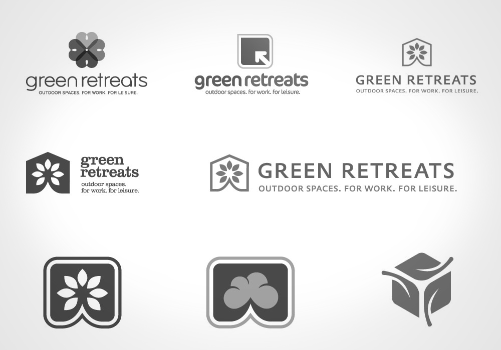
Green Retreats build high quality outdoor spaces that can be used for both work and leisure. Take a look at this movie that shows you how we created a brand new logo design that brings together the architectural space of the cube defined by green leaves to create a logo that reflects the stylish spaces they create..
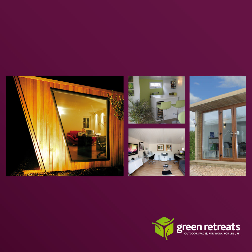
They manufacture wooden buildings for use as hobby rooms, garden rooms or home offices, and offer a stylish and sustainable alternative to a full extension – at a fraction of the cost.
They asked us to create a logo that reflected these qualities – and emphasised the green credentials of this type of building.
We came up with four options and presented these in what we call our Design Concepts stage – the video brings that process to life, and gives a typical idea of how we work with clients to present a range of ideas for them to choose their new logo design from.
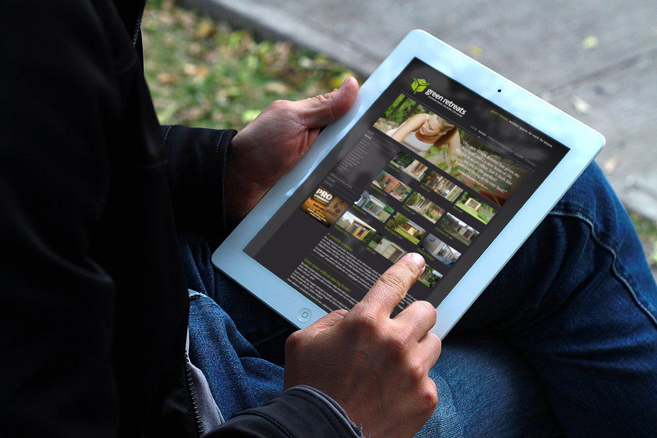
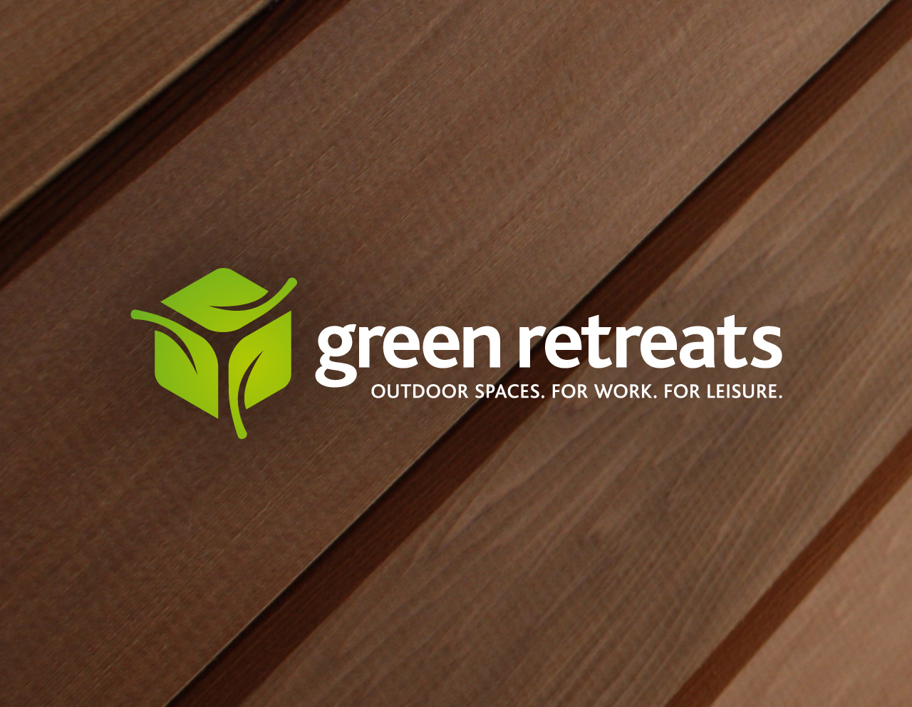
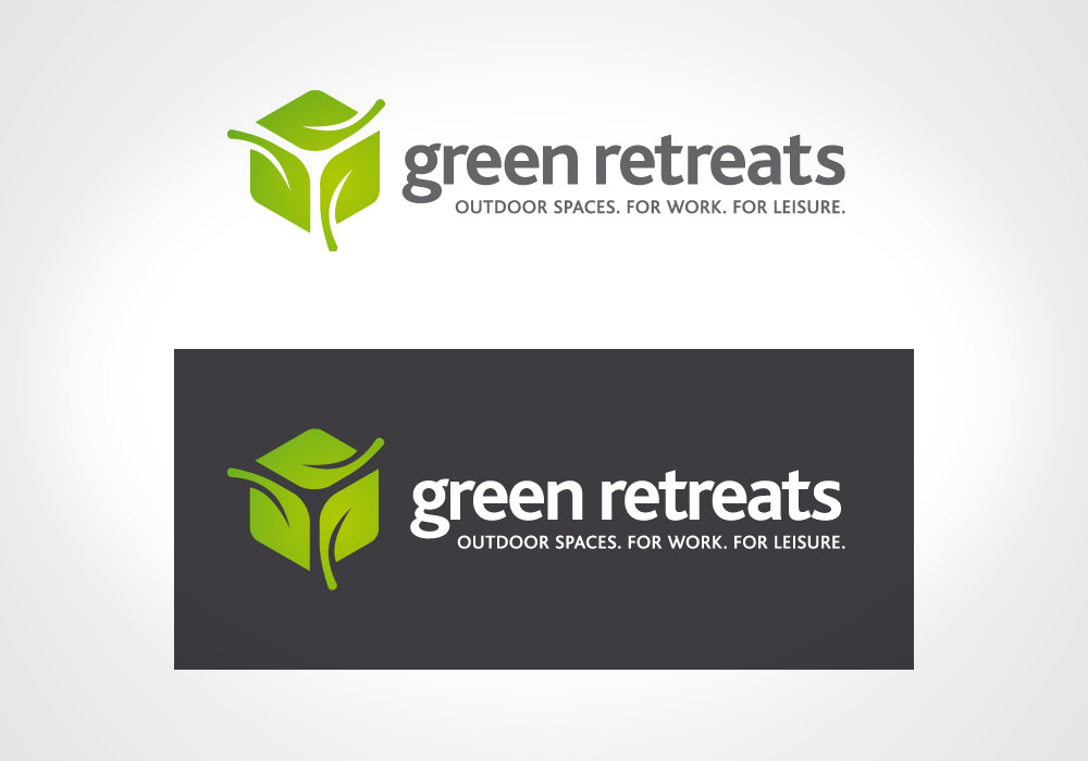
As always, the logo was designed to be easy to apply, and the video also shows some of the applications we helped them create to bring it to life – and turn it into a brand.
If you would like to talk about a new logo – or your existing brand and how it can be refreshed- call Colin or Sue on 01509 224466.